
The story behind the Avast amoeba and more.
When I joined Avast in late 2015, one of the most important things I was asked to work on for the company was understanding what the Avast brand means to our customers and determining how we could revitalize it. The Avast brand has been keeping people safe around the world since 1988. I was so amazed (and proud) to see how millions of people in countries from Brazil to France trust us to protect them. Avast is truly a global citizen when you look at where our product is used around the world.
Our logo and name also have a storied history – the company name, Avast, actually came from a product name launched back in 1988 (no pirate-related origin), and the 2010 logo we have been using up to today was designed by a very talented Avast employee, Martin Novak.
This is the logo for the first Avast branded product:
![]()
In early 2016, we sought to understand what our brand means to our customers. To start our quest to revitalize the brand, we first had to know what you, the people who are online every day, think of our brand and our competitors’ brands. We surveyed thousands of people in seven countries around the world – people who use mobile devices, laptops, or run their business online and want to be protected. And what they told us we did well was:
Now we know we are not perfect at this, but we know you care about it. So we are committed to getting better and better at this to deliver a great experience to you every day and to keep you safe.
Our organic “blob” originated with our 2010 logo. Its organic shape and arms around the letter ‘a’, symbolize our community surrounding Avast, which is so vital to our success. Recently, we have started calling it “the amoeba.” Not sure why. Maybe it is because I was a bio major in my first life. Blob or amoeba – you tell me. Or perhaps you can come up with something better. Either way, we love it. We embrace it. It is our community, and in an industry that uses a lot of sharp edges in its identity systems, it is nice to have a natural, organic shape for a change (it is that independent thinking I mentioned above.)
To determine how we wanted to evolve our logo and visual design, we took a thorough look at all the logos and visual designs from other companies in our industry to see what is out there. What we saw is a lot of shields and check marks. You also see a lot of red and blue and yellow.
We explored ways to more radically change our logo while preserving our brand equity, but in the end, our organic shape and orange color stood out nicely. We chose to have an evolution of our design, not a revolution and preserve our distinctive look.
![]()
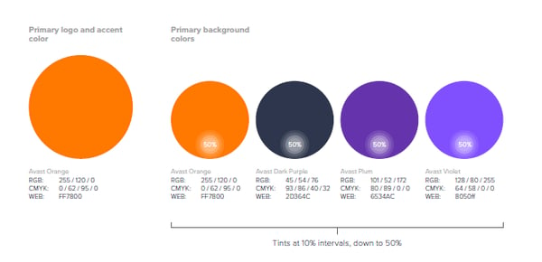
We love our orange, but it can look a little halloweenish when it’s left on its own with only grays and blacks alongside it. We wanted to retain our orange in our identity system because very few security companies own orange (see above paragraph) and we wanted to preserve the equity we have gained from millions of people who interact with our orange amoeba on their devices every day. However, we also wanted to get rid of the “blah effect” (as our CEO would say), so we introduced some complementary colors that make the orange look great.
Our new color palette includes a very deep purple, that almost looks navy blue, when we want to be more serious; and a plum, brighter purple when we want to have fun. Again, the color combination is unique in our industry and our job as marketers is to have our brand recognized and remembered. We are also limiting our color palette because in branding, less is more. Security is not something you think about every day, so we want to stand out with a distinct look that you can easily find and identify as Avast.
We also had some practical problems with our logo. The exclamation point at the end of our name was often mistaken for the letter ‘i,’ which resulted in certain people mistakenly referring to us as Avasti. A name that sounds more like we were founded in Italy rather than the Czech Republic. Also, our previous font could be difficult to read from a distance, and the ratio of the size of the company name to the amoeba’s height was out of proportion, so our name often appeared small.
We have a very talented internal team of designers, who took the design strategy and direction from our fabulous brand agency, siegel + gale, and refined our final logo to solve for these problems. I’d like to give a big shout-out to Matej Portes and Viktor Bielik from Avast for their graphic expertise and for making the new Avast brand a reality.
In the end, we opted for an evolution of our brand identity – not a revolution. Our aim was to preserve what we and our customers love about our look, solve the practical issues of past designs, and modernize our brand for the world we live in today.
Timing is everything, and we chose to launch the new logo at the time that we officially joined forces with AVG, our new partners in fighting cybercrime, to symbolize the “new” Avast. An Avast that is more ready than ever for the threats of tomorrow and works every day to outsmart those that want to do you harm online.
We hope you like it and would love to hear what you think.
1988 - 2026 Copyright © Avast Software s.r.o. | Sitemap Privacy policy